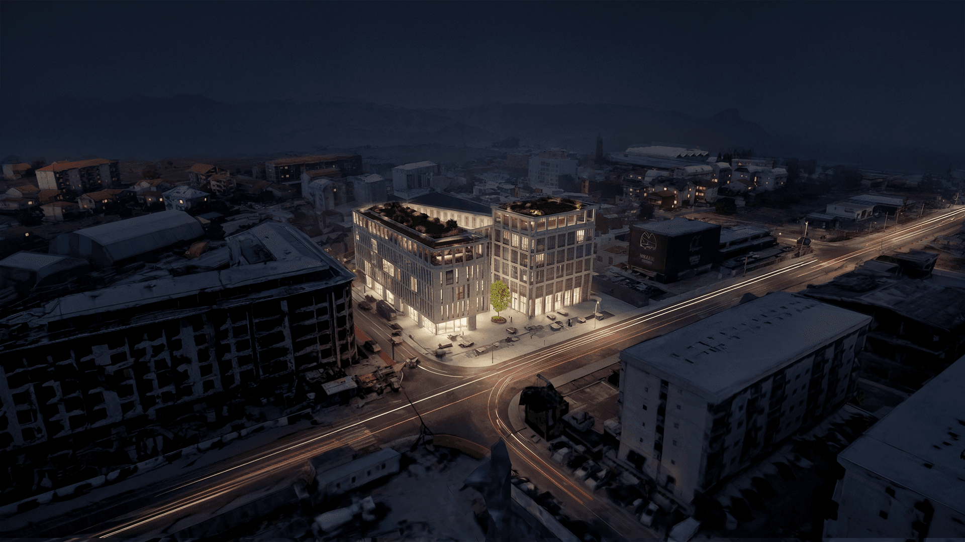
What Actually Makes a Public Space Work
Why does one square fill with life while another, a block away, sits empty? Four conditions, drawn from Jane Jacobs and tested on our own projects, decide whether a public space works.
A place isn't public because it's empty and open. It's public because people actually want to be there.
The Empty-Plaza Problem
Every city has two kinds of open space that look nearly identical on a plan and behave like total opposites in real life. One square is full: kids, coffee cups, someone reading, someone selling vegetables, a conversation that's clearly been going for an hour. The other, a block away and usually newer, bigger and more expensive, is a windswept void that people cross quickly and never once stop in. Same paving, same benches, roughly the same budget line. Completely different result.
The difference is almost never about taste or beauty. It comes down to a handful of conditions that are either present or they aren't. These conditions are well understood. They just get ignored, routinely, on project after project.
It Was Never About Size or Budget
The person who actually proved this, stopwatch in hand, was William H. Whyte, whose study of how people use small urban spaces gets quietly cited throughout our own work. After years of filming plazas, his finding was almost comic in how plain it was: what draws people in, more than anything else, is other people. Spaces work when they give people a reason and enough comfort to stay, somewhere to sit, something to watch, a bit of sun, an edge to lean against, not when they're built to impress from a drone shot.
Grand, empty gestures photograph beautifully and live badly. The liveliest spaces are usually small.
Jane Jacobs’ Four Conditions, in Plain Language
The deeper diagnosis belongs to Jane Jacobs. In The Death and Life of Great American Cities she laid out four conditions a place needs before it can generate real vitality (Jacobs, 1961). She was writing about neighbourhoods, but the logic scales up and down; we applied all four to an entire island at Poveglia.
The first is a mix of uses: the area has to do more than one thing, so different people are coming and going at different hours. A district that empties out at six was designed to be dead by six, whether anyone intended that or not.
The second is short blocks, plenty of corners and routes so people can weave through a place instead of trudging along it. Long, unbroken blocks quietly kill the small errands and detours that keep a street alive.
The third is a fine grain of old and new: buildings of different ages and rents sitting next to each other, because new construction can only ever house whatever can afford new-construction rent, while the older, cheaper stock is what actually shelters the café, the studio, the small shop that give a place its texture.
And the fourth is simply enough people, a real concentration of them present through the day, residents included, so the place stays populated rather than surging and emptying on a schedule.
Miss any of these and no amount of clever paving will save the space. Get them right and life tends to show up almost on its own. It's not really a coincidence that today's 15-minute city is mostly Jacobs' conditions rewritten for the climate era (Jacobs “reloaded”).
The Edge Is Where the Life Is
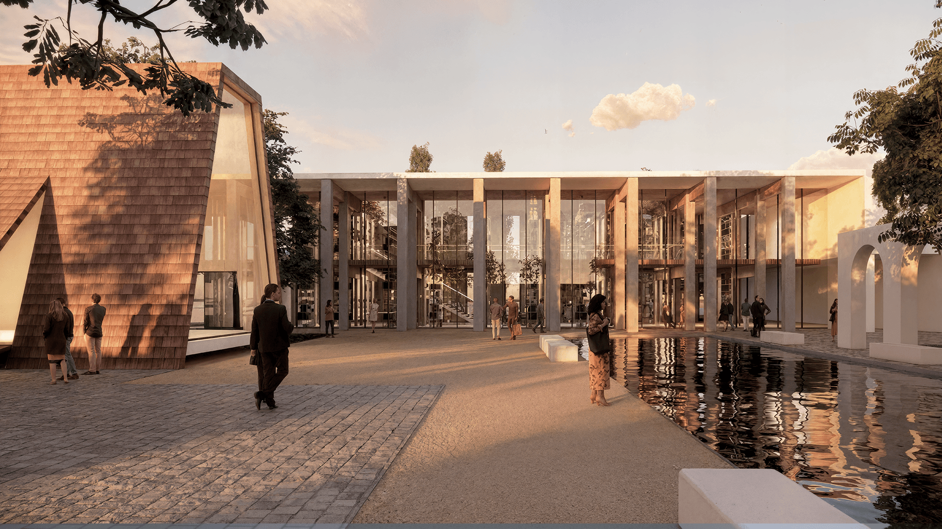
If there's one place worth concentrating effort, it's the edge, the line where a building meets the open space around it. People don't gather in the middle of an empty square. They line its sides, where they can sit with their back against something and watch the room. A good edge is soft and busy: a café spilling out onto the pavement, a colonnade to duck under, a ground floor with doors and windows and something happening behind them, somewhere to perch for a minute.
This is why we treat a building's ground floor and the street outside it as one continuous space rather than two separate ones. At Poveglia the colonnade does most of that work: sometimes a sheltered threshold, sometimes an active shopfront edge, always mediating between inside and out. Get the edge right and the centre of the space tends to take care of itself.
Pockets, Not One Big Void
The other move is to stop designing public space as a single grand emptiness and start designing it as a series of smaller, distinct pockets. The idea comes from Christopher Alexander's A Pattern Language, which our work leans on directly (Alexander, 1977): people engage on their own terms when a space offers several small settings, a step to sit on, a corner out of the wind, a wider spot where a market could happen, rather than one exposed expanse that flattens everyone into the same behaviour.
Density is the dial that tunes all this. Pull the buildings and planting in tight and you get intimate, sheltered pockets. Loosen them and you get openness and long views. Used deliberately, as a design tool rather than an accident of a plot ratio, density is how a public space ends up with both a busy corner and a quiet one.
Why This Matters Now
Public space has quietly become a public health question. Face-to-face social time has dropped, loneliness gets described as an epidemic often enough that it barely registers as news anymore, and in 2025 the World Health Organization issued its first global framework treating social infrastructure, the everyday places people gather, as a health intervention rather than a nicety (PPS, 2025).
The squares, stairs and edges that make people want to linger aren't a soft amenity anymore. They're some of the most useful things a city can actually build.
How We Test It
Our own shorthand, borrowed from the island project, is that a good public ground floor should breathe: expand into a busy square, contract into a sheltered pocket, and never present a single dead face to the street. Before we call a public space finished, we walk it against the four conditions above, plus one blunt question: would someone with a free hour actually want to stay here? If the honest answer is no, the render doesn't matter.
Good public space isn't expensive to understand. It's just easy to get wrong, usually by designing the empty middle instead of the living edge.
References
- Jacobs, J. (1961). The Death and Life of Great American Cities.
- Alexander, C. (1977). A Pattern Language
- Whyte, W. H. (1980). The Social Life of Small Urban Spaces.
- Ninković, K. (2023). The Revival: Poveglia’s Identity as Self-Sustaining University Campus. — [[source–the-revival-poveglia]]
- Jacobs and the 15-minute city: Jacobs “reloaded” (ScienceDirect).
- Public space as health infrastructure: PPS, State of Public Space 2025; CNU on third places & loneliness.
- Concepts: urban diversity, jane jacobs, third place, the existing as resource.